Meet Chloe Rubenstein: Local Artist Collection
Go behind the scenes of Chloe Rubenstein's Pride collection, a spirited mashup of history, community, and celebration built for women's soccer in Boston.

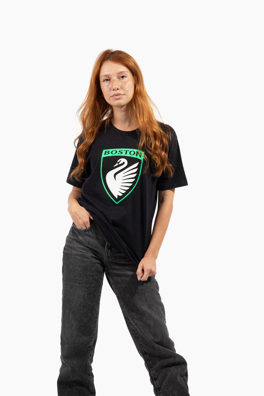
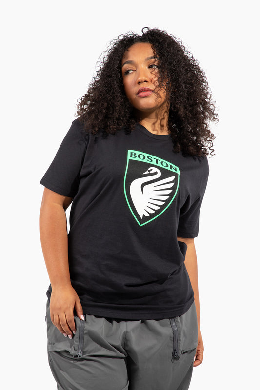
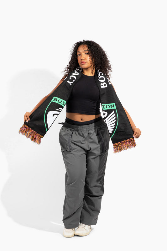
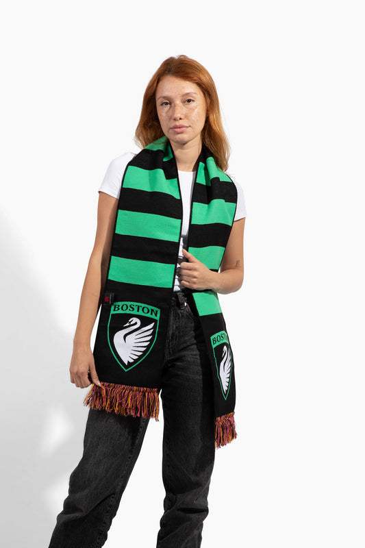
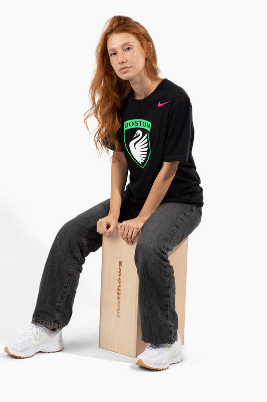
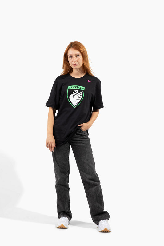
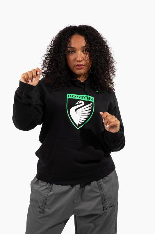
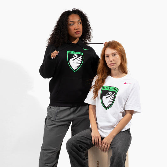
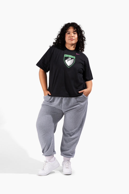
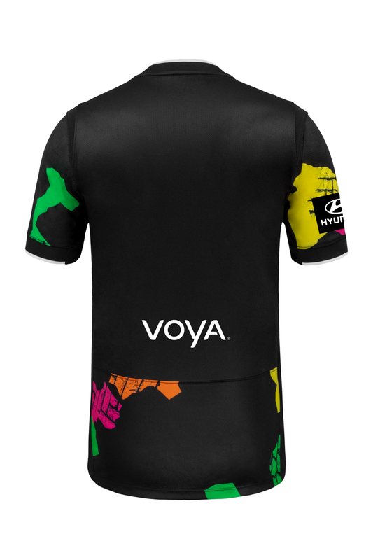
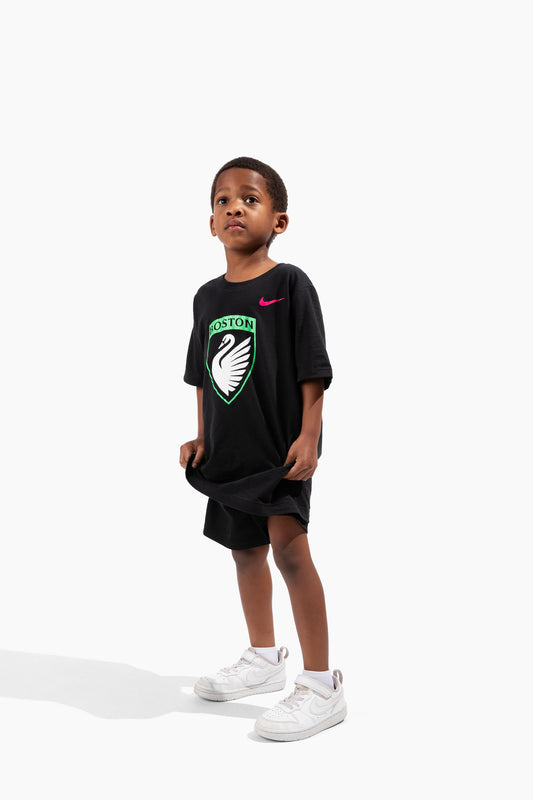
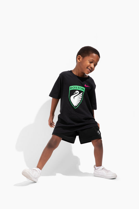
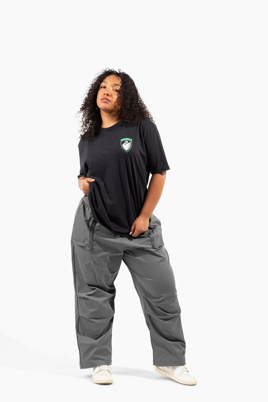
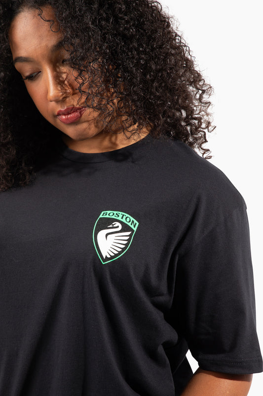
A Boston-based creative, Chloe teamed up with the club on a Pride collection that gives an iconic piece of women's history a fresh, illustrative twist. Pulling together the toughness of the Legacy swan and the legacy of Rosie the Riveter, she walks through how the design balances strength, identity, and celebration.
"Theres a level of grit that comes to who we all are today and why we celebrate… not just one month out of the year, but 365 days”
What inspired this collection?
When we think of Pride merch, we think of so many things that are rainbow-colored…whether it's making a logo rainbow or trying to find inclusive ways to say Pride is fun and Pride is a celebration. But there's also a history of battling and needing to be seen. My artwork is generally playful and a little cartoony, so using the Rosie the Riveter inspiration with the swan emphasized the toughness of women in sports and women in this franchise. Bringing those ideas together was a great way to say, yes, Pride is a celebration, but there's a level of grit that comes to who we all are today and why we celebrate…not just one month out of the year, but 365 days.
Walk us through the design?
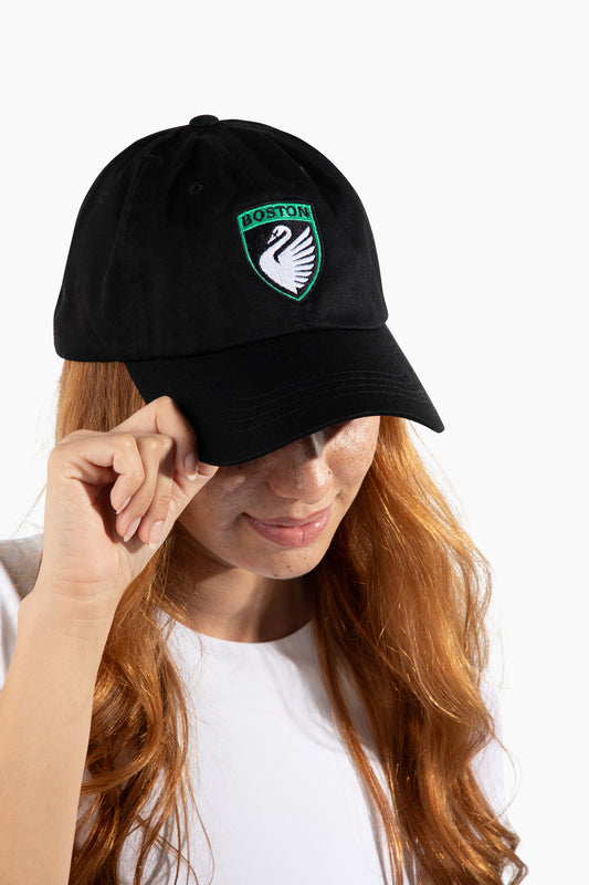
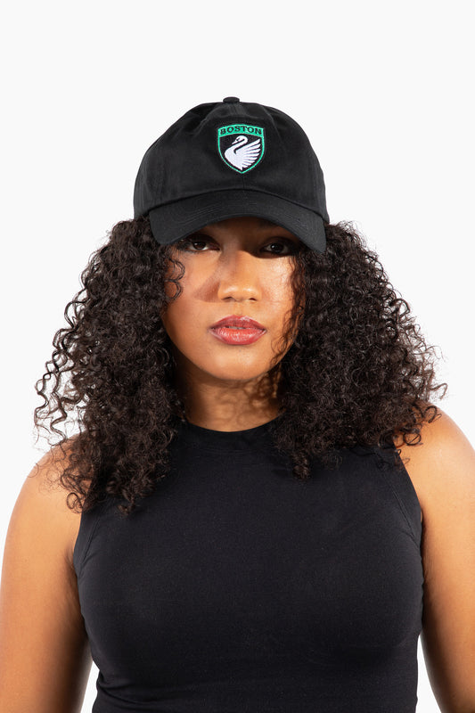
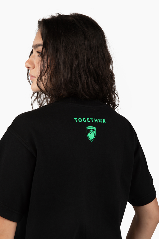
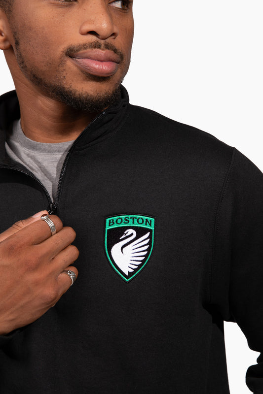
The homage to the Legacy colors was really important because it makes it clear this is part of the club. At the same time, the Pride pin on the collar speaks to supporting what's happening in women's soccer and paying homage to Boston. Every element was about finding the balance between strength, identity, and celebration.

Why was the riveter concept the right fit for this project?
It felt like a really good opportunity to take the Legacy swan and move it beyond a graphic design element into something that represents more of me and how I design. The Rosie the Riveter image is such an iconic symbol in women's history. We weren't trying to ignore the fact that women have been thriving for years and decades before this…we wanted to take something that represented grit and give it a more playful, illustrative spin.
What was the creative process like from idea to final design?
Most of the time people want something expected…a Boston skyline or familiar landmarks. To be given the creative freedom to be more playful is always exciting. When someone trusts you enough to explore an idea and make it your own, that's when you can create something that really connects with people.

What does it mean to you to be a creator from Boston?
Boston is such a passionate sports city, and people are always looking for that exclusive piece that feels special. I hope that's what this creator series becomes…something where people know, 'If you know, you know.' Whether you're a kid who loves collecting or someone who wants every piece of team merchandise, this can become one of those staple items that people remember as the first Pride collection.
What makes this collaboration special to you?
I think it's an honor to have someone from the NWSL look at my work and say, We see what you've built in Boston, we see the community you've created, and we want to bring that feeling into something we can share.That feels incredibly special. As a creator in Boston, it's hard to get started, but once you've built your brand, opportunities like this are what make all that work worthwhile.
What do you hope fans feel when they wear it?
I really hope people feel pumped up. I want the younger generation to look at it and think, 'I've got this super cool shirt,' and I want the older generation to recognize the historical references behind it. I love that it can connect someone who's just excited about a tough swan with someone who understands the deeper meaning. It's about bringing together Boston's history, women's history, and the moment we're trying to create on the pitch.